Plenty of client service shops go for a simple, no-frills website in favor of focusing on client work. We were no exception. This approach served us well through the years:
In 2011:
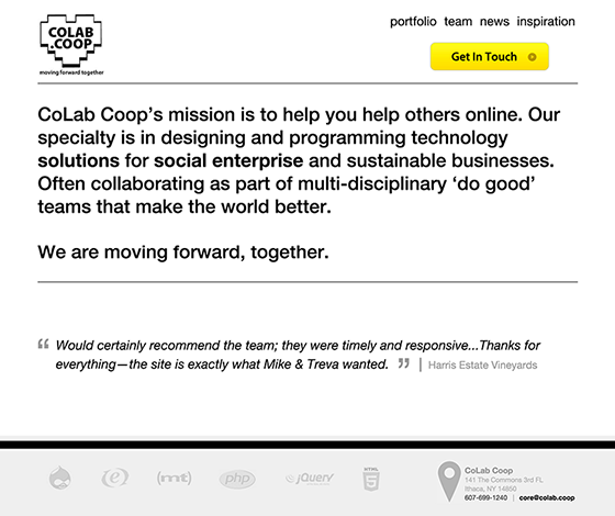
In 2012:
In 2013:
By the start of 2014, we were ready for a change.
Don’t call it a redesign
In early January, Rylan sent an e-mail to Ralph and Jenn:
Hey Friends,
Can we discuss some low hanging fruit to uplift the CoLab website for 2014?
– Rylan
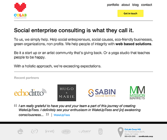
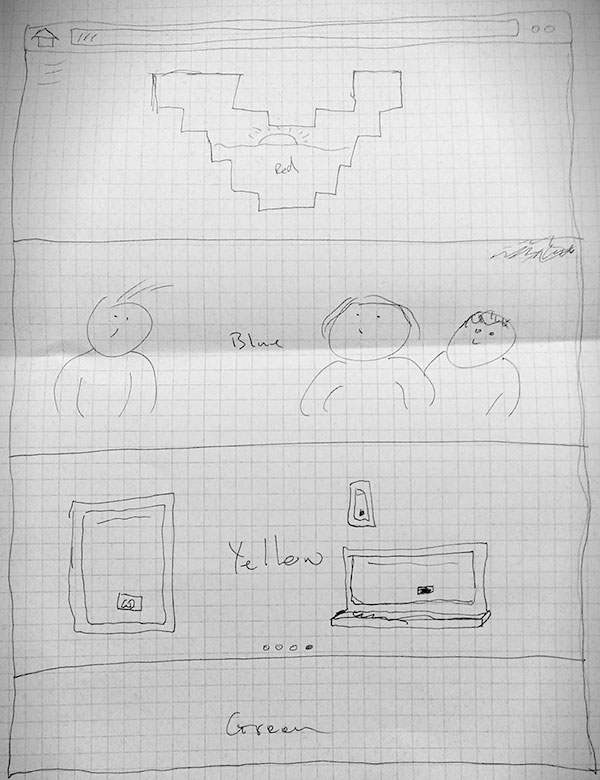
Ralph had been noodling with ideas and shared a sketch with Jenn. We were off to the races, but strapped for time, so we called it a refresh.
Here is the initial sketch:
And here is the prototype:
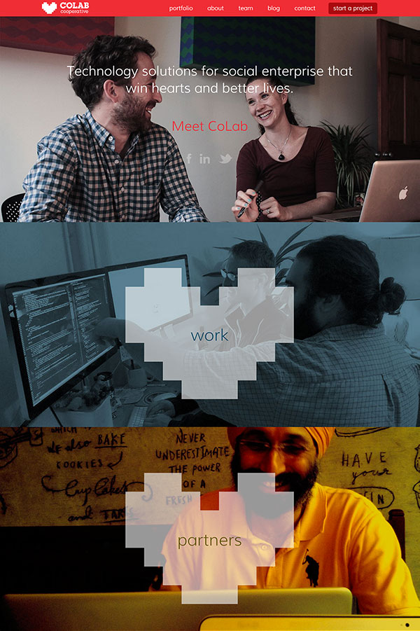
After a series of discussions over the next four days, we built a simple HTML prototype of the homepage and put it up. We iterated on the prototype until we had a version that was ready to release into the wild.
Feedback from collaborators and clients on the new homepage was great, but rest of the site was still on this old school thing called a fixed-width layout. Meaning, it wasn’t responsive.
We poked around and concluded that retrofitting our legacy templates was not worth the investment – and we needed to focus on a full redesign before end of year. We did what we could and left the rest. That got us most of the way to responsive in time for a March launch of the redesign… er, refresh.
It’s complicated
By October, we were stuck in analysis paralysis — a fancy way to say we were totally overwhelmed by the options.
The dev team was evaluating technical approaches: Jekyll? Docpad? Gulp or Grunt? Mustache or Handlebars?
The design team was debating layout decisions: menu on the top or side? Fancy animations or subtle transitions?
Jenn had a chunk of availability coming up and told the team to make their decisions. We would finish this thing. We decided two months was enough time to commit to a drop-dead launch in mid-December.
Setting goals
We were working with content strategist Jess Sand on another project so we asked her to conduct a landscape analysis, content audits, and client interviews.
This was a critical step in helping us focus.
Now we had data. We knew we needed to improve our content to more effectively communicate CoLab’s what, why, and how.
- Move to a custom, minimal content management system
- Re-design portfolio with more project details
- Re-design team profiles with more personal details
- Re-write our content from scratch
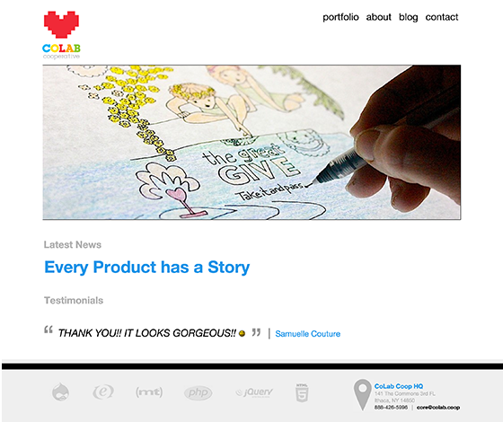
Now it’s a redesign
Everything went on GitHub, from the site repo to the front-end editor to the API. Content management came together quickly: Gulp plugins, plain HTML for pages, and Markdown for blog posts. (The lack of a classic WYSIWYG forced everyone to get real comfortable with Markdown. We liked that.)
Google docs were used to draft new content models for portfolio projects, team profiles, and our values messaging. We wrote enough content to feel comfortable moving into visual design. But our content model stayed flexible, changing as the visual design progressed.
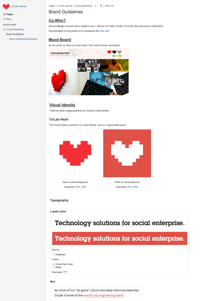
We spent a couple of days on wireframes in Moqups. To tighten our visual identity, we took stock of the many different elements we’d used over the last three years. We took the pieces we liked and refined them. The resulting style guide gave us the starting point we needed. Since our entire team uses JIRA, it made sense to maintain a style guide in Confluence.
Part of the style guide:
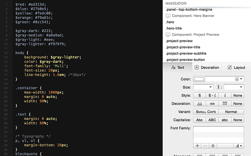
In a typical design workflow, Photoshop was used for quick mockups to start discussions. We weren’t aiming for pixel-perfection. When we found an element we liked, it became a SASS variable or mixin. Interactions were trial and error in code using CodePen or local files shared between team members using ngrok or a screenshare. Pages came together based on comps, code snippets, and ongoing conversation.
Designing in SASS:
Making time
While all of this was going on, we still had client projects. We had to make time — between meetings, on weekends, and on the edges of other client work.
All of CoLab was involved in the process — the staging site was open to any CoLabr and updates were included in our weekly internal digest. Everyone wanted to see it launch, so everyone made time to pitch in.
There were rough spots. Some weeks, some of us were more invested than others. Sometimes we questioned the investment and the value.
It came down to this: clients want to see our real-life professionalism reflected on our site. As a distributed team, keeping everyone united and connected is a priority and we wanted to portray that sense of togetherness to clients and the online community.
Lessons learned
We can see why others would prefer to outsource their redesign, even if they could do it themselves.
We found these exercises to be helpful:
- Role playing. Client projects need project managers for a reason.
- Being honest about goals. Does your company want to drive more leads? Or is everyone just sick of looking at the same homepage?
- Recruiting outsiders. Using a contractor for content analysis got us to focus.
It took us a nearly a year, but collaboration made it happen. Congratulations, team CoLab.